-v01.png)
A chord diagram is a data visualization tool that shows relationships or connections between different groups or entities.
A chord diagram is a data visualization tool that shows relationships or connections between different groups or entities.
A chord diagram is a graphical method of displaying the inter-relationships between data in a matrix. The data are arranged radially around a circle with the relationships between the data points typically drawn as arcs connecting the data.
The format can be aesthetically pleasing, making it a popular choice in the world of data visualization.
The primary use of chord diagrams is to show the flows or connections between several entities (called nodes). Each entity is represented by a fragment (often colored or pattered) along the circumference of the circle.
Arcs are drawn between entities to show flows (and exchanges in economics). The thickness of the arc is proportional to the significance of the flow.
.png)
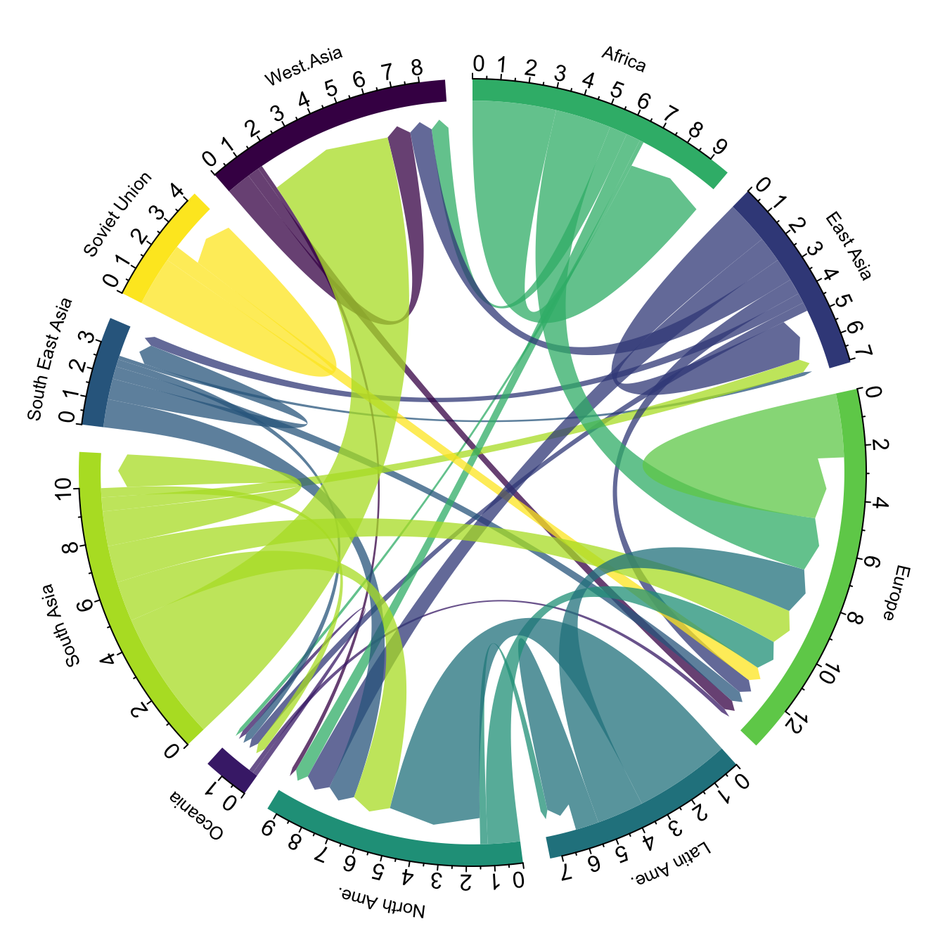
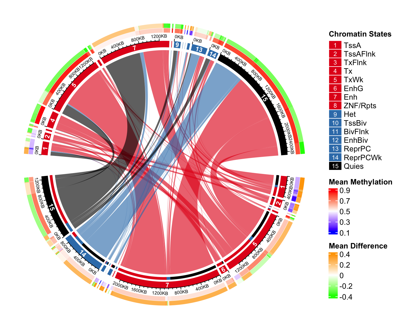
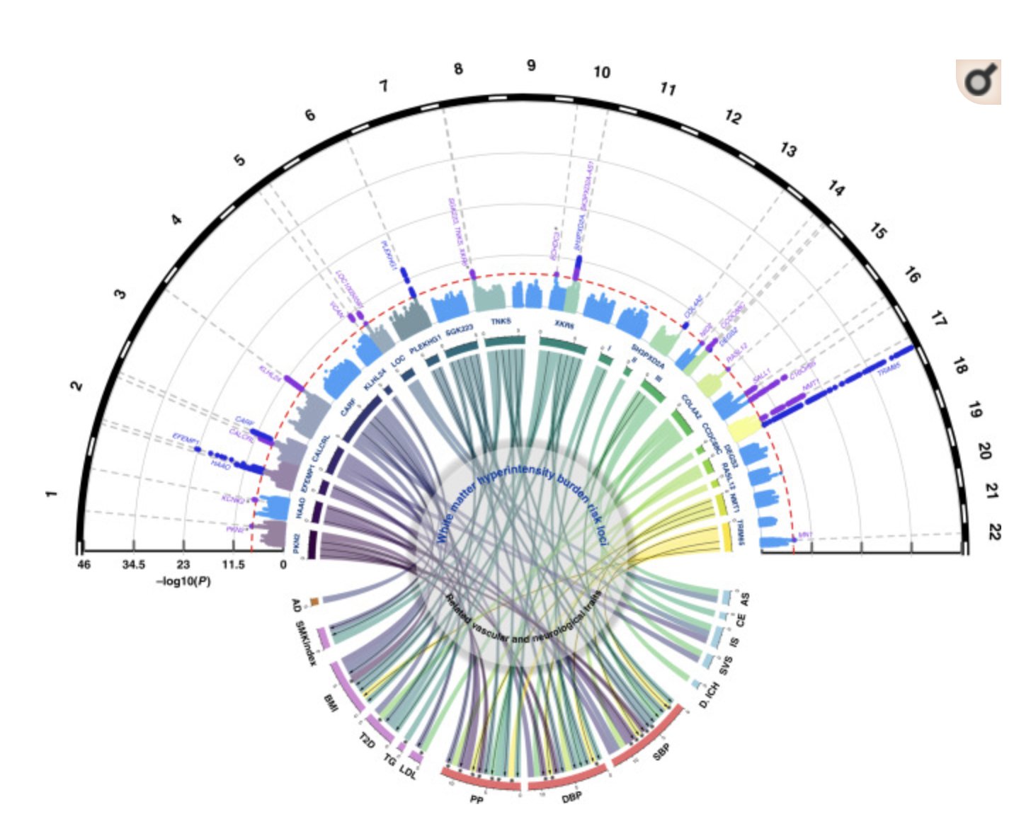
Chord diagrams can show pretty complex data.
Cumulative electricity trade (2015–2065) among African countries (TWh)

Chord diagrams can sometimes be unreadable.
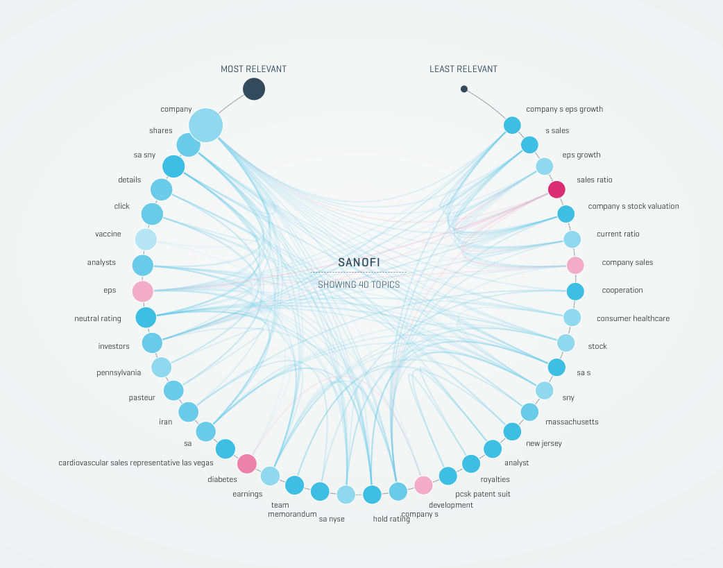
To create a chord diagram, you need data. In his Medium article LA Lakers Statistics Visualized Using Python Chord Diagrams, Saul Dobilas describes ways to create chord diagrams using Python and shows how this data can be prepared.
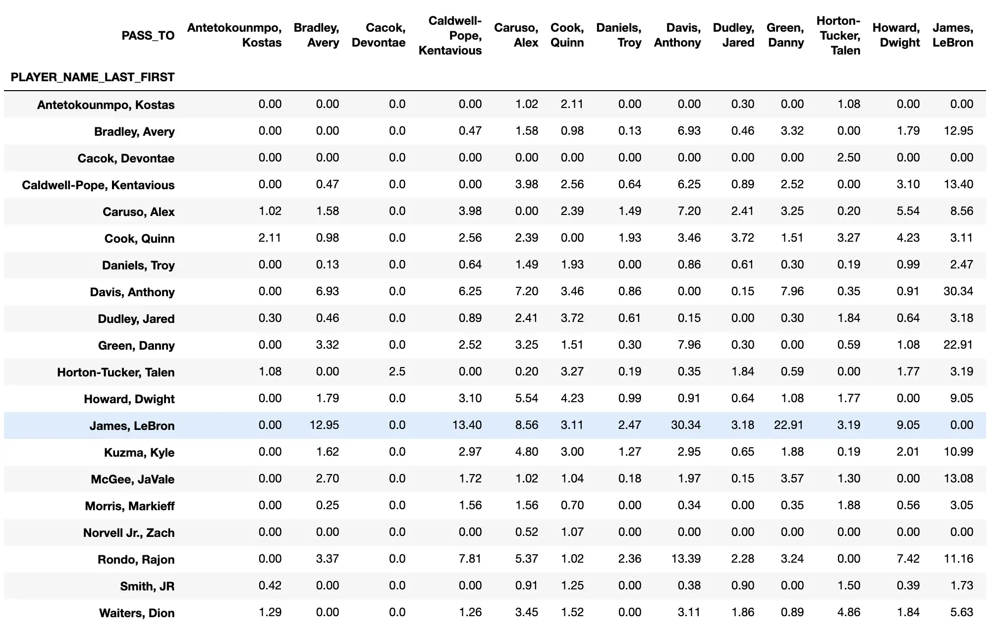
Passes made between LA Lakers team players. NBA Regular Season 2019–20. Picture by Saul Dobilas. Data from NBA Stats
And this is what his resulting chord diagram looks like.
Use chord diagrams
For showing relationships between entities and their relative magnitudes in comparison to alternative arcs.
As a result, chord diagrams are popular in migration studies, economic flows, and genome studies.
They have also been used to highlight unexplored relationships to help address the problem of filter bubbles.
Warning!
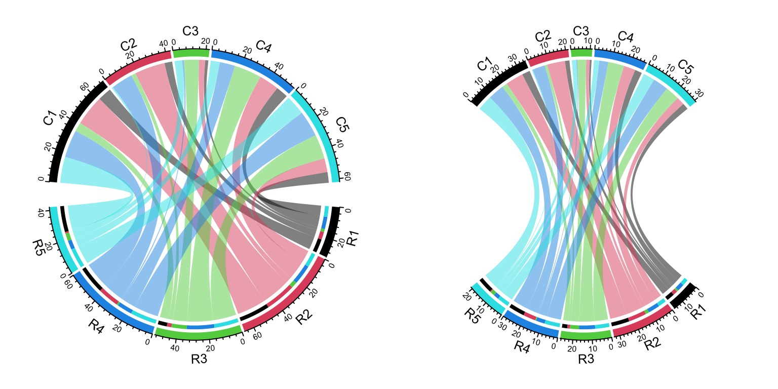
Chord diagrams can be difficult to read or interpret when there are many groups or categories involved, as the lines or arcs may overlap and become cluttered.
It can be difficult to accurately compare the size or magnitude of the relationships or connections between groups using a chord diagram, as the lines or arcs are not necessarily proportional to one another.
Don't use chord diagrams
For displaying data with a large range of values or a wide variability, as the lines or arcs may not be able to accurately represent the differences in the data.
For displaying data that is categorical rather than numerical.
For displaying data that cannot be clearly divided into distinct groups or categories.
For displaying data that requires more precise or detailed analysis or comparison than they can provide.
The chord diagram was the first card I designed for The Data Visualization Deck. Instead of coding the diagram with Python or another tool, I used Figma, so it must be treated as an illustration.

Chords in Figma are made simply by adding corner radii to shapes
But in real life, chord diagrams may become cluttered. One way to make them more readable is using something called “Hierarchical edge bundling,” proposed by Danny Holten. More about this — in the article on Seeing Complexity.

Vadim Pajasu
Product designer, consultant, owner. I help entrepreneurs and founders prepare important pitches — so their audiences make right decisions.
We're making this Deck real. Leave your email to get notified when it's in stock and ready for purchase. No spam!
Subscribe for news, notes, insights, giveaways and stuff:
What are chord diagrams used for, and how to build them using R or Python graph galleries?
Chord diagram — from Data to Viz
Explaining chord diagrams in a really slow, confusing and wrong way (just so you know).
Design
Vadim Pajasu


.jpg)